Using the Network Diagram
The Match Configuration page offers a visual network diagram as an alternative to the pairs table. This diagram provides an intuitive, graphical representation of how your datasources are connected for matching.
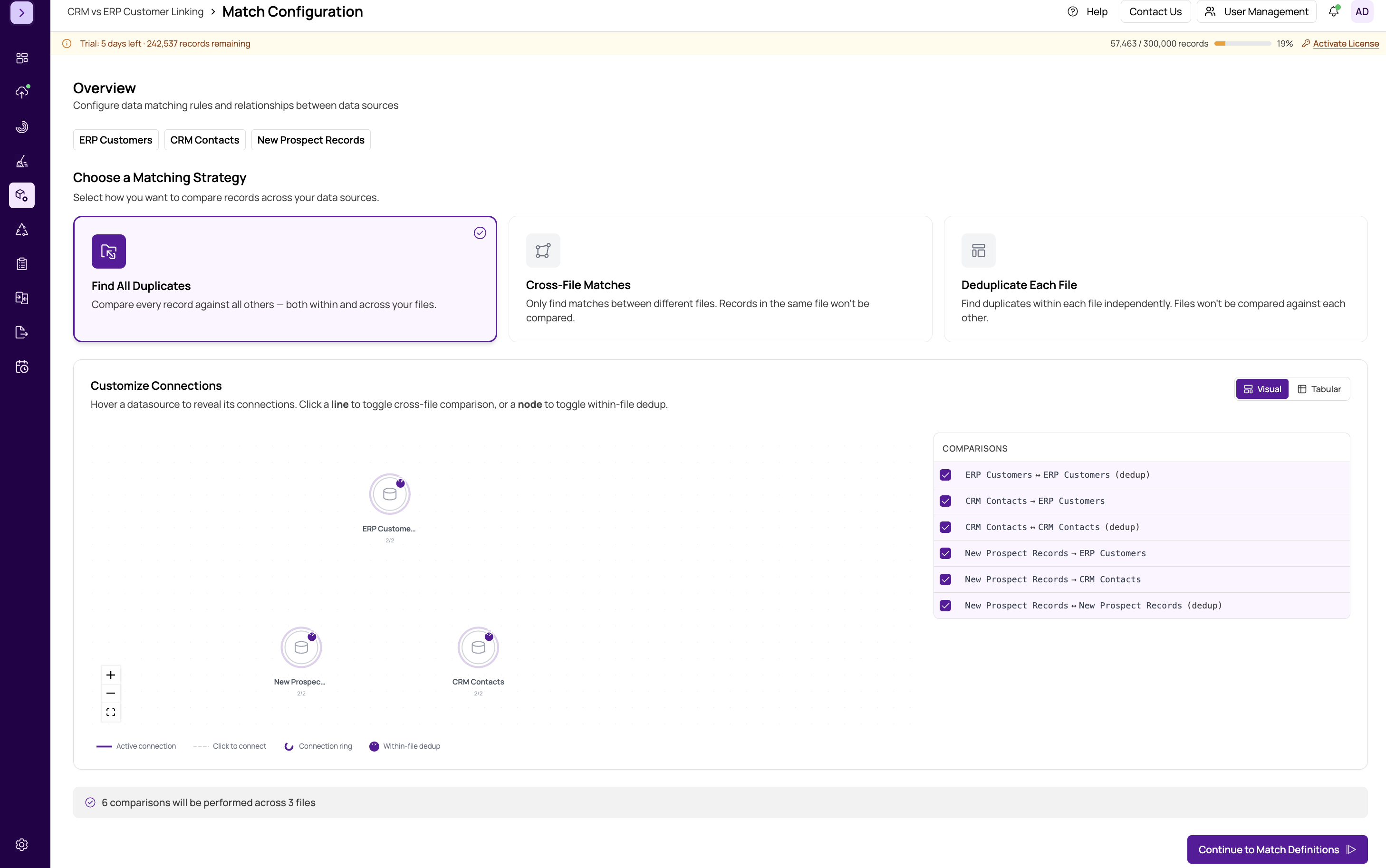
Switching to Diagram View
Toggle between the table view and the diagram view using the view switcher at the top of the configuration panel. Both views reflect the same underlying configuration — changes in one are immediately reflected in the other.
Reading the Diagram
In the network diagram, each datasource appears as a circular node labeled with the datasource name. Lines (edges) between nodes represent configured match pairs:
- Bidirectional arrows indicate within-file matches, where a datasource is compared against itself for internal deduplication. These appear as a loop or self-referencing connection on a single node.
- Directional lines between two different nodes represent cross-file comparisons. The line connects the source datasource to the target datasource.
If a pair is enabled, the connecting line is solid and clearly visible. Disabled or unconfigured pairs have no connecting line between their respective nodes.
Interacting with the Diagram
The diagram is fully interactive:
- Drag nodes — click and drag any datasource node to reposition it on the canvas. This is helpful for arranging complex configurations with many datasources so the diagram is easier to read.
- Hover over a node — when you hover over a datasource node, its direct connections are highlighted while all other nodes and edges fade into the background. This makes it easy to see exactly which datasources a particular source is configured to match against.
Tip
The network diagram is especially useful when you have three or more datasources. It gives you an at-a-glance view of your matching topology that is much easier to parse than a long table of pairs.
When to Use the Diagram
Use the diagram view when you want to:
- Quickly verify that all datasources are connected
- Identify isolated datasources that are not part of any pair
- Present the matching configuration to a colleague or stakeholder
- Understand the overall structure of a complex multi-datasource match
For detailed pair-by-pair adjustments (enabling or disabling specific pairs), the table view in https://help.matchlogic.io/article/394-configuring-datasource-pairs may be more efficient. Use whichever view suits your workflow.
Important
The diagram is a read-only visualization of your pair configuration. To enable or disable specific pairs, switch to the table view or use the pair checkboxes.