The Profile Overview Dashboard
After generating a data profile, the Overview tab presents a comprehensive dashboard of interactive charts and metrics. This dashboard gives you an at-a-glance understanding of your datasource's quality, structure, and readiness for matching.
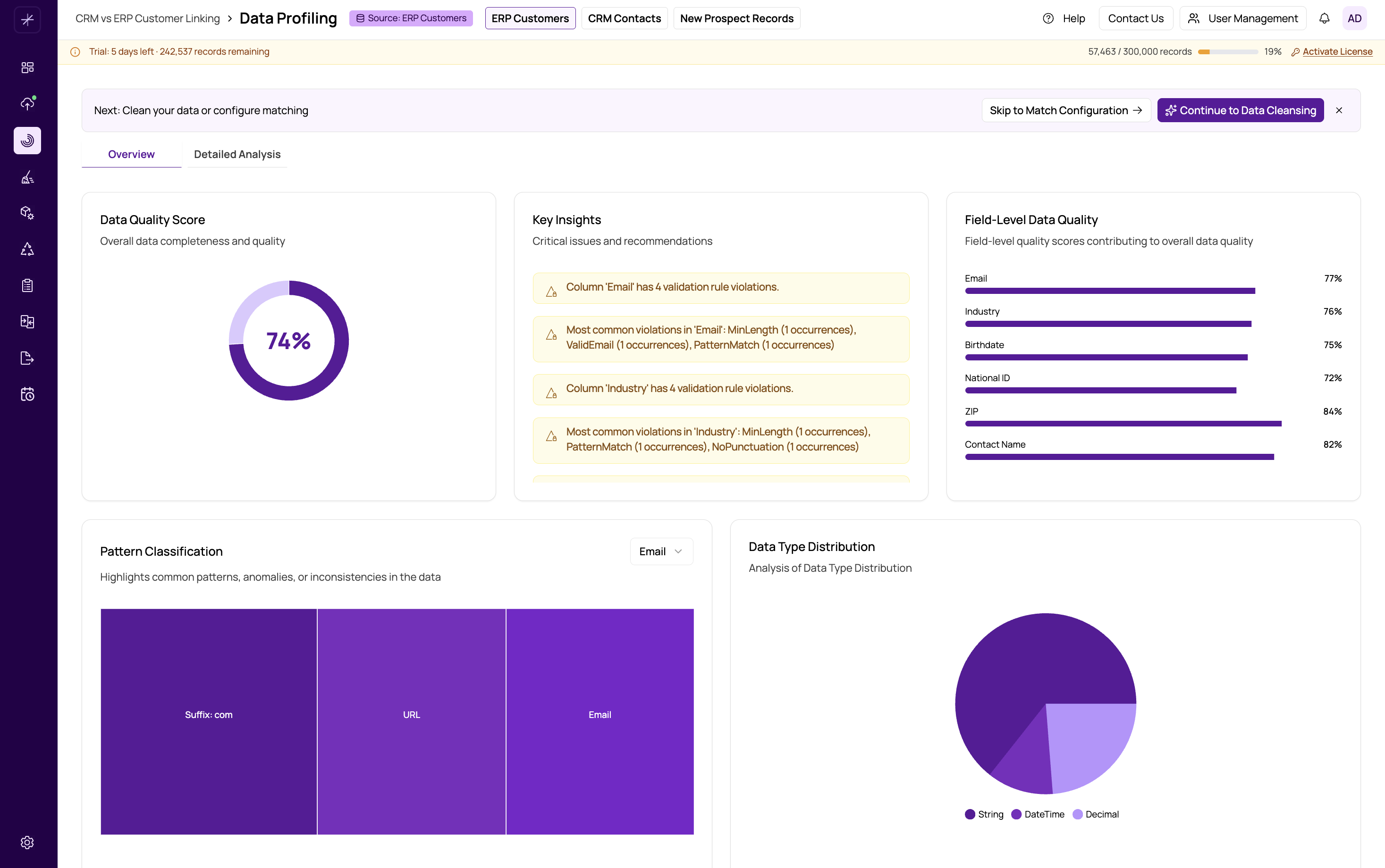
Dashboard Layout
The Overview dashboard is organized into several visual panels, each highlighting a different aspect of your data quality:
- Data Quality Score -- A donut chart showing the overall percentage of complete, valid data across all fields. This is your top-level quality indicator. See data-quality-score for details.
- Key Insights -- Alert cards that surface the most important findings, such as fields with high null rates, unusual patterns, or potential data issues that need attention.
- Field-Level Quality -- Individual quality scores for each column, letting you quickly identify which fields are clean and which need work.
- Pattern Classification -- A treemap visualization showing discovered data patterns grouped by frequency. Larger blocks represent more common patterns. See validity-and-pattern-analysis.
- Data Type Distribution -- A chart showing the detected data types for each field along with confidence percentages. See data-type-distribution.
- Data Validity -- A bar chart displaying valid versus invalid record counts per field, based on detected or custom regex patterns.
- Anomaly Detection -- Highlights values that deviate significantly from the norm using statistical analysis. See anomaly-detection.
- Character Composition -- A breakdown of character types (alphabetic, numeric, punctuation, spaces) per field. See character-composition.
- Data Uniqueness -- Shows how many distinct values exist in each field relative to total record count. See uniqueness-and-duplicate-indicators.
Interacting with Charts
All charts on the Overview dashboard are interactive. You can:
- Hover over chart elements to see detailed tooltips with exact values and percentages.
- Click on chart segments or bars to filter or drill down into the underlying data.
- Resize panels by dragging panel borders to focus on the metrics most important to you.
Reading the Dashboard Effectively
Start with the Data Quality Score at the top. If the overall score is above 80%, your data is generally in good shape for matching. Scores between 60-80% suggest some cleansing would be beneficial. Below 60%, you should strongly consider running data cleansing before proceeding.
Next, scan the Key Insights cards for any critical warnings. These highlight the most impactful issues found during profiling.
Then review Field-Level Quality scores to identify specific columns that may need attention. Fields you plan to use as matching criteria deserve the closest scrutiny.
Tip
Focus your analysis on the fields you intend to use for matching. A field with low quality that you never use for matching is less of a concern than a key matching field with even moderate quality issues.
Switching to Detailed Analysis
For a deeper look at individual metrics and record-level data, switch to the Detailed Analysis tab. See https://help.matchlogic.io/article/232-detailed-analysis-view for a full guide to that view.